Summary for the Blog
- Dashboard is a visual aid presenting crucial facts and KPIs in one accessible location for data-driven decisions.
- They are essential for consolidating data, real-time monitoring, improving team alignment, faster decision-making, and performance tracking.
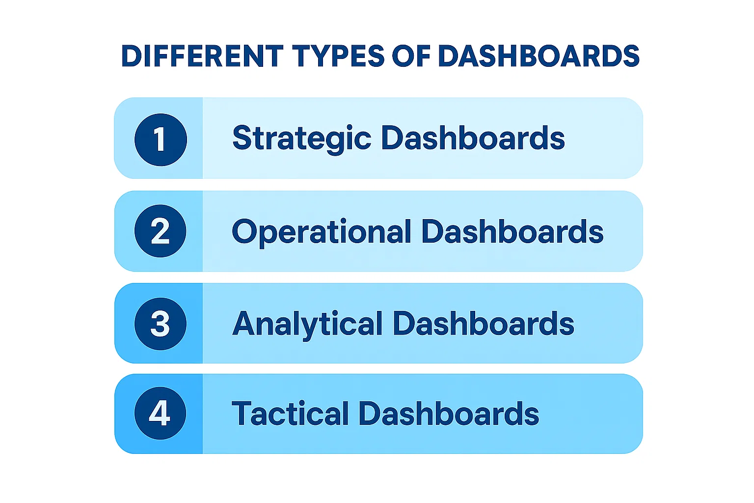
- There are four main types of dashboards: Strategic Dashboards, Operational Dashboards, Analytical Dashboards, and Tactical Dashboards
- ViewMetrics is highlighted as a solution for integrating marketing and website data into a single, user-friendly dashboard, offering features like pre-built templates, effortless data syncing, integrations, custom reports, and collaboration tools.
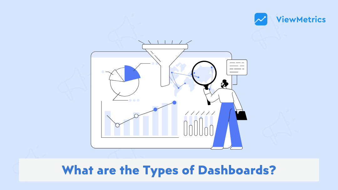
You open a dashboard and somehow still don’t know what’s going on. The numbers are there, the charts are there, but none of it feels useful for the decision you actually need to make. That’s not a data problem. It’s a dashboard problem. Most businesses aren’t short on data. They’re short on the right view of it.
There are four main types of dashboards: strategic, operational, analytical, and tactical, and each one serves a different purpose and audience. Using the wrong one means leadership is making long-term calls on short-term noise, and frontline teams are poring over summary reports when they need live alerts. This guide breaks down each type plainly so you can start building dashboards that actually help people decide.
What is a Dashboard?
A dashboard is a visual aid that presents the most crucial facts and KPIs for your company in a single, easily accessible location. It makes data-driven decision-making and KPI tracking easier.
Without having to open ten tabs or export several spreadsheets, a dashboard makes it simple to observe how things are doing. You can track website traffic, marketing campaigns, or your sales funnel. It’s your data command center, to put it briefly.
Dashboards use charts, graphs, tables, and other visual aids to display data that has been pulled from multiple sources, such as Google Analytics, Facebook Ads, Instagram, and others. With real-time or almost real-time updates, you can make better judgments more quickly.
Also Read: What is the Difference Between Dashboards and Reports?
Why Does Your Business Need Dashboards?
Dashboards are essential if you are serious about using your data effectively. Here’s how they help:
- Everything in One Place: You can stop toggling between Google Ads, Facebook Insights, GA4, and Excel sheets. Dashboards bring all of that data into one place. Hence, you get a complete overview of your marketing and business performance.
- Real-Time Monitoring: With dashboards, you get live updates. Whether it’s campaign spend, click-through rates, or daily leads, you are never in the dark. You can spot both problems and achievements quickly.
- Better Team Alignment: Different teams need different metrics. Dashboards let you customize views for sales, marketing, product, and leadership. So everyone on your team remains on the same page and works toward the same goals.
- Faster & Smarter Decisions: When data is easy to understand and access, you can make better decisions quickly. That means fewer delays, missed opportunities, or wasted ad spend.
- Performance Tracking: Set goals and track how you are doing in real-time. Whether it’s revenue, engagement, or customer acquisition, dashboards help you stay focused.
Types of Dashboards – At a Glance
| Features | Strategic | Operational | Analytical | Tactical |
|---|---|---|---|---|
| Purpose | Track long-term business goals | Monitor real-time activity | Uncover trends and patterns | Track short-term team progress |
| Best For | Executives & founders | Operations & front-line teams | Analysts & marketers | Managers & team leads |
| Data Frequency | Monthly / Quarterly | Real-time / Hourly | Historical | Weekly / Daily |
| Focus | Big picture | What’s happening now | Why it happened | Is the team on track |
| Examples | Revenue vs target, ROI | Support tickets, ad spend | Campaign trends, acquisition sources | Sprint progress, weekly leads |
4 Different Types of Dashboards?
There are four types of dashboards: operational, strategic, analytical, and tactical. Each has a different purpose and is tailored to specific audiences.
1. Strategic Dashboards
A strategic dashboard gives leadership a high-level view of how the business is performing over time. It tracks long-term goals using key metrics like revenue growth, customer retention, and ROI, all in one place. Instead of diving into daily activity, it helps executives and decision-makers see whether the business is moving in the right direction. Think of it as the big-picture view that keeps long-term strategy on track.
Purpose: Help leaders monitor overall company performance and long-term goals
Prime Users: Executives, business owners, board members
Features:
- Summary of key business KPIs
- Monthly or quarterly data updates
- Clean, high-level visuals
Examples:
- Revenue vs target
- Marketing ROI over time
- Customer growth trends
2. Operational Dashboards
An operational dashboard tracks day-to-day activities and real-time performance across your business. It is built for managers and frontline teams who need to monitor what is happening right now, not last month. Metrics like website uptime, support tickets resolved, or daily sales give teams the visibility to act fast when something needs attention. If something breaks or slips, an operational dashboard is usually the first place you will see it.
Purpose: Monitor daily or hourly activities and processes
Prime Users: Managers, operations teams, support staff
Features:
- Frequent or live data updates
- Real-time alerts or KPIs
- Focus on short-term actions
Examples:
- Website uptime
- Support tickets resolved
- Budget spending pace
3. Analytical Dashboards
An analytical dashboard is built for going deeper into your data to understand the why behind performance. It uses historical data, filters, and drill-downs to help analysts and data teams uncover trends, spot patterns, and run comparisons over time. Unlike other dashboard types, it is less about quick decisions and more about thorough investigation. It is the right tool when you need answers that go beyond what the numbers show on the surface.
Purpose: Analyze historical data and spot trends or patterns
Prime Users: Analysts, marketers, product managers
Features:
- Deep-dive charts and filters
- Custom date ranges and comparisons
- Focus on analysis over instant action
Examples:
- Campaign performance over 6 months
- Customer acquisition sources
- Social engagement trends
Related Read – What is Analytical Report?
4. Tactical Dashboards
A tactical dashboard sits between strategic and operational, focusing on short-term projects and departmental goals. It helps team leads and middle managers track progress on specific initiatives, campaigns, or targets within a set timeframe. The data is more detailed than a strategic dashboard but more focused than an operational one. It gives teams a clear picture of whether their current efforts are on track to hit near-term objectives.
Purpose: Track mid-term objectives and team progress
Prime Users: Team leads, campaign managers, freelancers
Features:
- Project timelines and weekly KPIs
- Team-based performance stats
- Focus on goal achievement
Examples:
- Weekly lead count
- Team tasks completed
- Social media calendar tracking
<VMCTA1 />
How to Choose the Right Type of Dashboard?
With four types of dashboards available, picking the right one can feel overwhelming. But the choice becomes simple once you ask the right questions. The best dashboard for you depends on your goals, your audience, and how quickly you need to act on data. Here are the key factors to consider:
1. Start with “Who will use this dashboard?”
The audience is the single most important factor in choosing the right dashboard type.
- Executives & Founders: Need a big-picture view of business health → Strategic Dashboard
- Managers & Team Leads: Need to track progress toward goals → Tactical Dashboard
- Operations & Front-line Teams: Need to act on live data → Operational Dashboard
- Analysts & BI Teams: Need to explore trends and patterns → Analytical Dashboard
2. Define the Decision You’re Trying to Make
Every dashboard should exist to help someone make a specific type of decision. Ask yourself: what question does this dashboard need to answer?
- “Are we hitting our annual targets?” → Strategic Dashboard
- “What is happening in my business right now?” → Operational Dashboard
- “Why did this trend happen, and what does it mean?” → Analytical Dashboard
- “Is my team on track this quarter?” → Tactical Dashboard
3. Think About How Often You Need the Data
How frequently your data needs to be refreshed is a strong signal for which dashboard type fits best.
- Real-time / Hourly Updates → Operational Dashboard
- Daily / Weekly Reviews → Tactical Dashboard
- Monthly / Quarterly Reviews → Strategic Dashboard
- Historical + Deep-dive Analysis → Analytical Dashboard
4. You Don’t Have to Choose Just One
A common mistake is trying to fit everything into a single dashboard. Most businesses need more than one type running at the same time. Your marketing team might use an operational dashboard for daily ad spend, an analytical dashboard to review monthly campaign trends, and a tactical dashboard to track quarterly OKRs. Build each dashboard around a single purpose; a focused dashboard is easier to read and leads to faster decisions.
Tips to Design an Effective Dashboard
A great dashboard is not just about displaying data. It is about making that data easy to understand and act on at a glance. Here are the most important tips to keep in mind when designing your dashboard:
1. Define the Purpose Before You Build
Before adding a single chart, get clear on what the dashboard is for and who will use it. A dashboard built for a CEO looks very different from one built for a marketing manager. Knowing the audience and the decisions they need to make will guide every design choice you make.
2. Focus on the Most Important Metrics
It is tempting to show everything, but a cluttered dashboard confuses more than it helps. Stick to the KPIs that matter most for the goal at hand, ideally no more than 5 to 7 metrics per view. If a number does not drive a decision, it probably does not belong on the dashboard.
Related Read – What Is KPI? Types, Examples & How to Track KPIs Effectively
3. Choose the Right Visualization for Each Metric
Not every data point needs a bar chart. Use line charts to show trends over time, bar charts to compare values across categories, and single number tiles for key metrics like revenue or conversion rate. Using the wrong chart type makes data harder to read, not easier.
4. Put the Most Important Information First
Users should be able to understand the dashboard within seconds of opening it. Place your highest-priority metrics at the top left, since that is where the eye naturally goes first. Supporting details and drill-downs can sit lower on the page.
5. Keep the Design Clean and Consistent
Use a consistent color palette, font size, and layout throughout. Avoid decorative elements that add visual noise without adding meaning. A clean dashboard builds trust in the data and reduces the mental effort needed to read it.
6. Use Filters and Drill-Downs for Flexibility
A single dashboard cannot serve every question, but filters can get close. Allow users to slice data by date range, region, channel, or team without needing a separate dashboard for each view. Drill-down functionality lets people explore further when they need more context.
7. Make Sure the Data is Reliable and Up to Date
Even the best-designed dashboard loses credibility if the data is stale or inaccurate. Set up automated data syncing so your metrics refresh on a schedule that matches how often decisions are made. Daily, weekly, or real-time updates all depend on the dashboard type and its purpose.
8. Test It With Real Users Before Finalizing
Show the dashboard to the people who will actually use it before you call it done. Ask them what they understand at first glance and what confuses them. Feedback from real users almost always surfaces issues that seem obvious in hindsight, like a metric label that is unclear or a chart that is harder to read than expected.
One of the biggest pain points for marketing professionals and business owners is juggling data from different platforms. You switch tabs, export CSVs, try to compare metrics, and lose time. ViewMetrics Solves that!
It integrates all your favorite tools like Google Ads, Facebook, Instagram, and GA4 into one simple, user-friendly dashboard. So, instead of wasting hours gathering data, you can spend time using that data to drive results.
ViewMetrics Brings All Your Marketing Metrics Together in One Place
If you want to create a social media dashboard without spending hours collecting data manually, ViewMetrics can simplify the process. The platform helps businesses connect their accounts and turn raw performance data into clean, ready-to-use dashboards for faster reporting and better decision-making. It currently supports dashboard reporting for Facebook, Instagram, and LinkedIn, making it a practical option for brands focused on these major social channels.
With ViewMetrics, you can track key metrics such as follower growth, engagement, reach, impressions, clicks, and campaign performance in one place. Instead of switching between multiple platforms, you get a centralized view of your social media performance that is easier to analyze and present to clients or stakeholders.
Another advantage is automation. ViewMetrics can sync data directly into Google Sheets, Docs, and Slides, helping teams create reports and presentations faster. This saves time, reduces manual errors, and ensures your dashboards stay updated with the latest numbers.
Whether you are a marketer, agency, or business owner, ViewMetrics makes dashboard creation easier by combining data visualization, reporting, and collaboration into one streamlined workflow.
Our Dashboard templates:
Ready to simplify your reporting workflow? Explore ViewMetrics Templates
<VMCTA2 />
Related Posts
-

Data is everything in today’s fast-paced business world. Business companies can evaluate their performance based…
-

Raise your hand if you’re nervous about giving a presentation. Is your hand raised? Don’t…
-

Summary for the Blog Market intelligence is the process of collecting, analyzing, and interpreting information…
-

Ad hoc reporting offers a flexible way to generate customized reports tailored to specific business…
-

Running Quarterly Business Reviews (QBRs) that focus on your customers while also driving product growth…